Your work environment greatly influences how you see your files on screen and in print. For best results you need to keep your surrounding colours as neutral as possible. The colours of the walls and ceiling in your work space can greatly affect how you see colour on your monitor. The colour of your clothes reflecting back on to your monitor can also affect this.
Please set your desktop display to neutral grey as bright colours and patterns can also affect how you view your images.
Setting up your Photoshop colour settings is simple and well worth your time.
These options, along with the ‘Colour Management Policies’ will make sure all images are in the proper colour space for you. They will alert you if not so action can be taken to correct the problem at the beginning of your workflow.
We highly recommend using a Spyder Colourdata calibrator for your monitor. This device cost a couple of hundred dollars and will provide a comfort level that what you are seeing is the same as you will see in your prints from Picpress.
Datacolor Spyder 4 Pro – calibration tool available from Kayell click here.
The Spyder Display device attaches to the front of your monitor and reads colour patches displayed by the software. Using these readings, the software helps optimize the brightness/contrast/colour output, removes any colour cast from your screen, and creates a profile describing how your monitor displays colour.
When calibrating your monitor, set your target white point and Gamma curve to 5000k and Gamma to 2.2. All files must be submitted in sRGB colour space.
After the monitor has been calibrated verify the calibration process by placing a small test print order. We recommend using images that you generally shoot. Compare the test prints with the monitor.
Lastly, because of ongoing use, we strongly recommend calibrating your monitor every 2-4 weeks.
With visual calibration compromises will need to be made in how close your prints will match your display. How you see colour and hardware limitations all contribute this method not being an exact science, though this method is better than no calibration at all.
To get started using this method you will first need to submit your four free 8x10 prints to Picpress, when you receive them back you will need to compare them to the files on your monitor. Remember your files on your monitor need to look like the prints you have received back from us. You will need to use the buttons/dials on your monitor.
Before you start making adjustments write down your monitors values, this will be handy in case you need to go back to your original settings. Set your monitor to 5000 degree Kelvin as the display temperature. 5000K is chosen because it is closest to daylight.
Look at your print and notice what disturbs you the most about it, is it too bright, too dull or contrasty? Adjust this first do not be afraid of making big adjustments. At first make large adjustments to see if you are using the correct tool. When you have determined you are making the correct adjustment make smaller adjustments until you are happy that the file on your monitor look more like the print. Once you are happy with your first adjustment continue to work through anything else you do not like about the print.
Remember there is no calibration method that is perfect; the best that can be accomplished is a reasonable representation of the print. To verify your calibration is correct order a couple of more prints to compare to your monitor now that you have adjusted it.
Please save your files in sRGB colour space in 8-bit colour, not 16-bit, to achieve the best print results. Also, please do NOT embed any profiles. Please - no CMYK, Grayscale, RAW, PSD or LZW compressed files, and if you work in layers, be sure to flatten the file and remove any extra channels before sending. We print from JPEG format files. Highest quality JPEG compressions are more than adequate for high quality printing. It is nearly impossible to distinguish a JPEG print from a TIFF print with the naked eye.
It is best to save your files at 300dpi sized at the size print you require,
All of our printers work in sRGB colour space, so working in a larger colour space will not offer any real advantage in printing. We recommend that you set your entire workflow into the same colour space from your camera to your chosen editing program through to printing.
The simple answer is no. It is nearly impossible to tell by eye a print made from a tiff or a high quality jpeg.
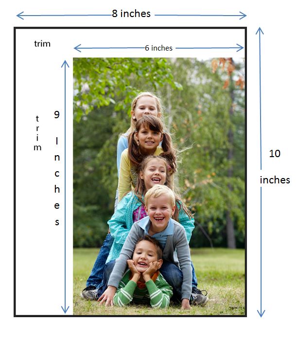
Our printers are limited to standard print sizes only. However you can have a custom size by placing your file onto a canvas in Photoshop. Simply go to canvas size and make you canvas the next standard size up from the size you require. Place your file into the corner of the canvas and using the text tool type trim into the area you need trimmed. Please note only prints 12x18 and above will be trimmed. See example below.